Infant Rooms Overview
This is our first look at infant rooms in this series, but I suspect it will not be the last. In the future, I plan to focus in on specific areas, like changing table setups. Now, the plan is simple critiques of the rooms (or as much of them as we can see) as a whole. The criteria for photos making this post: first, they all popped up on the first page of results in a “ child care infant room” image search, second, their resolution was high enough, they interested me.
Let’s go to the photos.
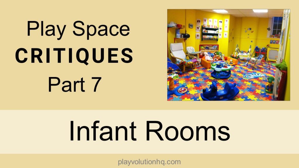
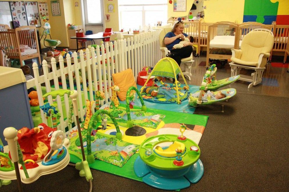
It’s bright. Overly bright. And overstimulating. I’m wearing sunglasses as I type this.
What is the intended audience for the bulletin board and wall hangings? They’re mounted too high for infants. So is the monitor. Also, why’s there a monitor? There’s no credible research suggesting screen time is beneficial to infants. All of that stuff could go and the room would be a bit calmer.
Lots of baby containers. I count 13, excluding the rocking chair. I first ran across the term Containerized Kids in Richard Louv’s Last Child In The Woods. The term is attributed to Jane Clark, a professor of kinesiology (the study of human movement).
Louv writes that young children, “spend more and more time in car seats, high chairs, and even baby seats for watching TV. When small children do go outside, they’re often placed in containers-strollers-and pushed by walking or jogging parents. Most kid-containerizing is done for safety concerns, but the long-term health of these children is compromised.” (Richard Louv. Last Child in the Woods: Saving Our Children From Nature-Deficit Disorder (Kindle Locations 441-446). Kindle Edition.)
The cribs and highchair may be required by licensing. The other four baby containers could be pruned from the space. It’d provide more room to move about. Babies should be free to roam and explore, not caged up in shiny plastic devices.
Movement is part of the sensory integration process. Speaking of sensory integration, this space is visually overstimulating and tactily under stimulating. There are not a lot of textures beyond Smooth Plastic to explore.
The windows are lovely. I suspect the curtains are closed to avoid glare in the photo. Or maybe they don’t want the brightness of the room’s furnishings to keep the neighbors awake at night.
Finally, why is there carpet and a cushy rug on the napping side of the room, and hard tile on the awake and active side?
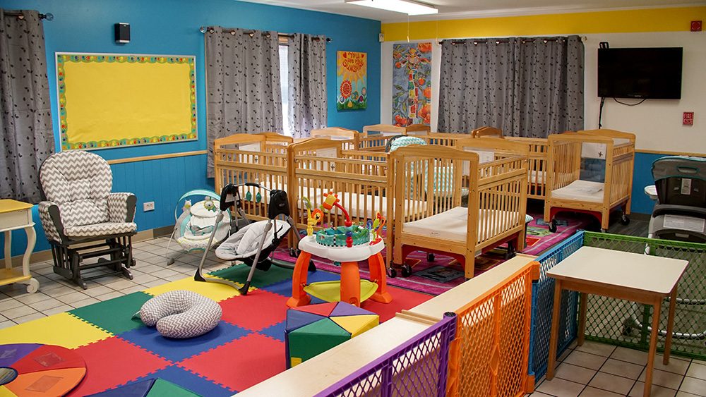
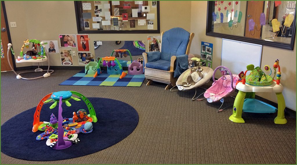
It is not as visually overstimulating as the last one, but it has more baby containers. I count 16.
I like the muted wall colors. The darker color in the napping area makes sense.
The flooring also seems a lot more infant-friendly than in the last image.
Not much tactile variety–very plasticentric. The space could use some more textured fabric. Maybe some pine cones.
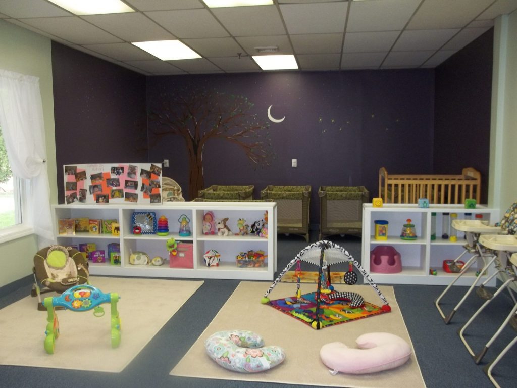
I assume the picture display is for the children to look at. It’s too high for them up there. Why not mount the pictures below the window under a sheet of clear plastic?
Nice wall and cabinet colors. A window that looks out on some nature. The flooring is good–not as hard as tile and easy to clean.
I like the rug. I’d like it better without the letters. Are they supposed to make the rug educational? They don’t. “Sure, I remember the day I finally learned the alphabet! I was eight months old, propped up in an exersaucer surrounded by doohickeys, and trying to push through a new tooth. I glanced at the floor and there it was–A…then B…and C! My life changed that day,” said no one. Ever.
More mounted-too-high-for-the-babies-to-see wall stuff. These displays should be at kids’ eye level–or not exist at all.
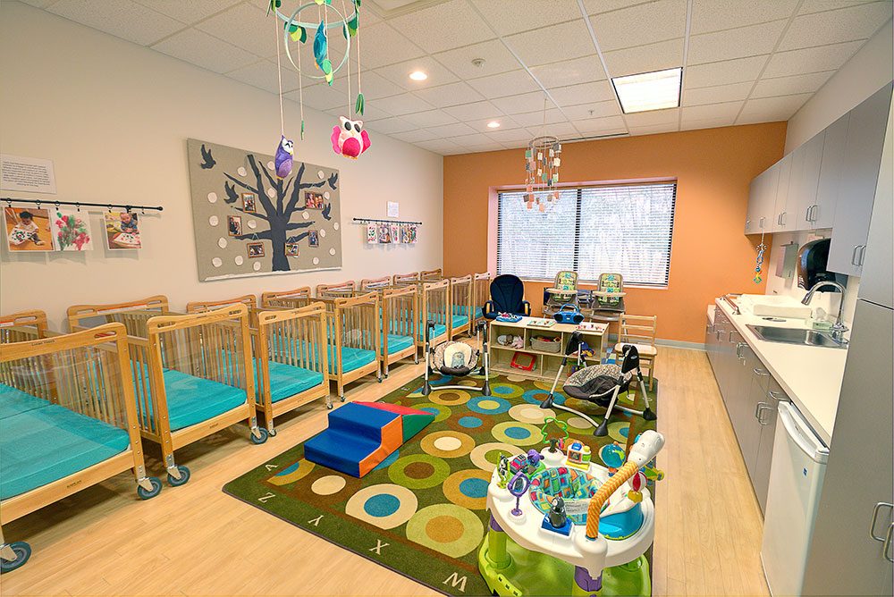
Not a great view of it in this photo, but the changing table setup looks efficient. Looks like a good setup. Lots of storage space too, that’s nice to see–but I wish we knew what was inside all those doors.
I count 20+ kid containers in this picture. Emmi Pikler and Megda Gerber would disapprove.
Another overly bright room with THFKTSWS (Too-High-For-Kids-To-See Wall Stuff) Infant rooms should mount the wall stuff aimed at the kids where the kids can see it.
The carpet is on the activity side of the room and the tile is on the napping side, so that’s nice.
The fence works. It’s a natural color, unlike the plastic divider panels in the first picture. It divides the space while allowing the kids to see the whole room.
No THFKTSWS here! Here we have LEFKTSWS (Low-Enough-For-Kids-To-See Wall Stuff). The mirror and dry-erase board are outstanding. The photos, not so much. They look like stock images aimed at teaching something–see how they are labeled? Why? Pictures of the children in the room, their caregivers, their siblings, their parents–even their pets–would be better.
If only the LEFKTSWS weren’t hidden behind all those baby containers. How many do you count?
Aside from a bit of load molded plastic, the colors are muted and calming.
Wow!
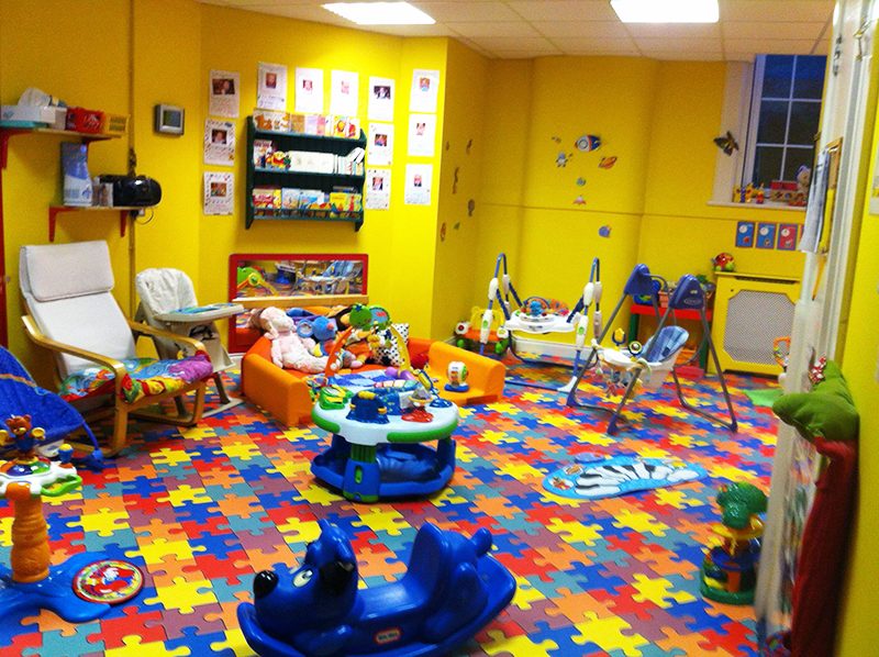
This. Is. Something. Infant rooms brighter than this can’t exist. I mean, it’d be physically impossible.
The mirror mounted low on the wall is nice to see–except that it reflects the room it is in.
Wait! Maybe it is an enchanted mirror, the little ones can crawl through into a rotating selection of tranquil and well-appointed infant rooms. Infant rooms lacking baby containers and THFKTSWS. Infant rooms lacking equipment, walls, and flooring that yell, “LOOK AT ME! ARE YOU NOT VISUALLY STIMULATED?” Infant rooms where they can easily move about, interact with peers, engage their senses, and stimulate–but not overstimulate–their busy brains.
Infant Rooms Conclusions
Let’s wrap up with a few final thoughts about containerized kids. There’s no credible evidence that exersaucers, swings, bouncy seats, and the other baby containers benefit children. The evidence seems to lean the other direction and shows that these devices can delay physical development. Expelling these devices from all infant rooms will be my first act when I’m made Intergalactic Decider Of All Things To Do With Infant Rooms (You can call me IDOATTDWIR, for short).
Have thoughts on the photos–or thoughts on our thoughts? Share them in the comments. You’ll find more play space critiques here.
Post Author
Jeff Johnson is an early learning trainer, podcaster, and author who founded Explorations Early Learning, Playvolution HQ, and Play Haven.


Leave a Reply