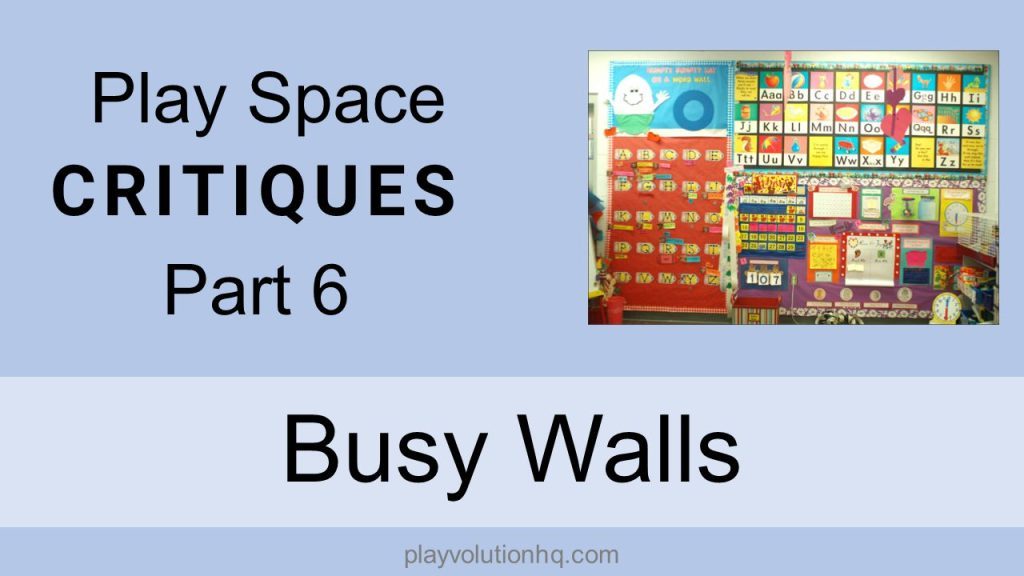
In this fun filled edition of our Play Space Critiques series, we’re looking at busy walls. Some early learning program classroom walls are visually stimulating to what I’ll kindly call a point of excess. There’s just too much going on. There’s no place for eyes to rest. I’m so visually overstimulated and blinded by the following examples that writing this post will require multiple rest breaks. During those breaks, I’ll do 25 push-ups to burn off over stimulation energy and then sit in a dark room to rest my eyes.
Let’s get started.
There’s so much too much going on here. The wall wasn’t big enough–the door gets the overflow. “Busy Walls? We have too much stuff. All vertical surfaces must be busy-fied.
The stuff with the tiny type and no pictures must be for adults, right? Some of those things regulations require to be posted? Who reads it? Maybe people who get bored waiting for a meeting in the office?
The posters are probably there to check a Diversity box on some environmental assessment.
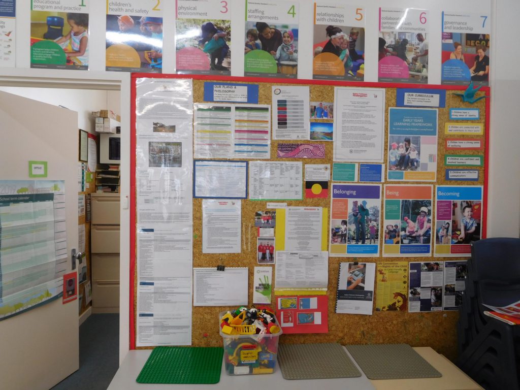
How often do things on this wall change? So much of it is laminated! Laminated Wall Stuff either means “this is important AND needs to be durable” or “Adamaris in the office relaxes by laminating stuff when she’s stressed”
The stuff that’s for adults could just as easily be tucked away in a three ring binder. Much of the other stuff could be trashed. The result would be a wall with space for eyes to rest. To avoid busy walls, ask yourself these question before hanging something up:
- Who is this for?
- Why must it go on the wall?
- How will it make this environment more user-friendly?
If you don’t have good answers, don’t hang it up. Busy walls are a choice.
Push-ups done and eyes rested, let’s move on.
It’s blinding!
When can we move past the whole kids-need-to-be-surrounded-by-bright-colors thing? I’d like to track down the person who came up with the ideas and lock him in a small room with florescent lighting and this stuff on all 4 walls.
Let’s answer the above questions for this wall. This is 100% for adults, and it must all go on the wall to signal that “learning is happening here”, or that “reading is important”, or that “it is February 9, the 107th day of school, and O week”.
Kids can learn to read, write, count coins, read calendars, tell time, and everything else without any of the stuff on the wall. Some would argue that this stuff can actually slow the process.
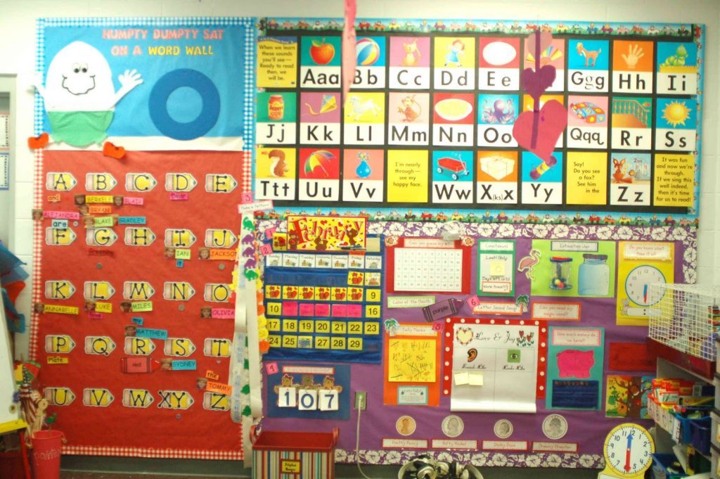
How much time goes into creating and maintaining busy walls? Are there not better uses for that time?
Imagine how overwhelmed the Official Classroom Rodent that lives in the cage on the right is. Her people evolved in cozy, dark places that never visually screamed at them. She must be so happy when the lights go off at night.
The above busy walls are more busy, but there’s still a lot going on here. It’s still cluttered with no place for eyes to rest.
Kids learn language by engaging with the world and other human beings in meaningful ways. Has anyone ever reflected on their childhood and reminisced, “Boy, that Letter Wall in kindergarten was so inspirational. It made me the reader I am today, it did. But I still feel sorry for X, down there on the bottom–wordless.”
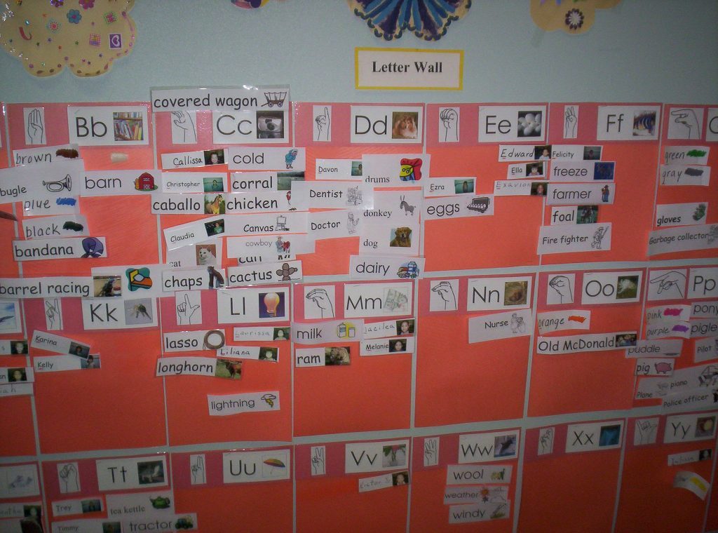
The effort on display here is adult effort. This could all be replaced by writing done by actual children and some white space.
That’s a lot of yellow. Do many kids in this classroom eat soft-boiled eggs served in egg cups?
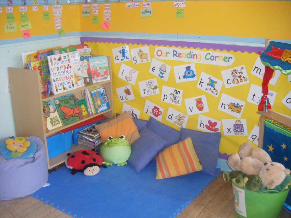
My Reading Corner makeover: Everything on the walls gets trashed, and the walls get a couple coats of pale sea foam green paint. The blue mat gets replaced with an earth tone area rug. Everything else can stay.
Another photo, another example of busy walls. Clutter from floor to ceiling.
Again, all the writing on display was done by an adult. Again, early learning can (and does) happen without any of this wall stuff.
Can anyone read the small print under the letters along the ceiling from more than 6 feet away?
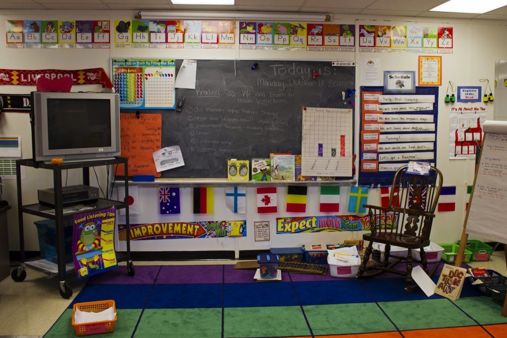
Are those Flags Of Diversity there to tick another environmental assessment box? Are kids really into flags nowadays? Wouldn’t a strip of empty space on that wall be a welcome place for already fidgety Galido to rest his eyes during circle time?
I have thoughts on the rug, but we’ll save that for a future, Very Special Episode of Play Space Critiques.
Busy Walls Conclusions
I had intended to include two more images in this post, but I can’t go on.
Busy walls do nothing to enhance early learning spaces for children. In fact, they are counterproductive. The sensory overload can impact children’s focus and behavior. The walls may be the reason That Kid is climbing the walls and driving you batty.
Have thoughts on the photos–or thoughts on our thoughts? Share them in the comments. You’ll find more play space critiques here.
Brought to you by Explorations Early Learning
Contribute content to Playvolution HQ
Post Author
Jeff Johnson is an early learning trainer, podcaster, and author who founded Explorations Early Learning, Playvolution HQ, and Play Haven.
Leave a Reply