Table of Contents
Overview
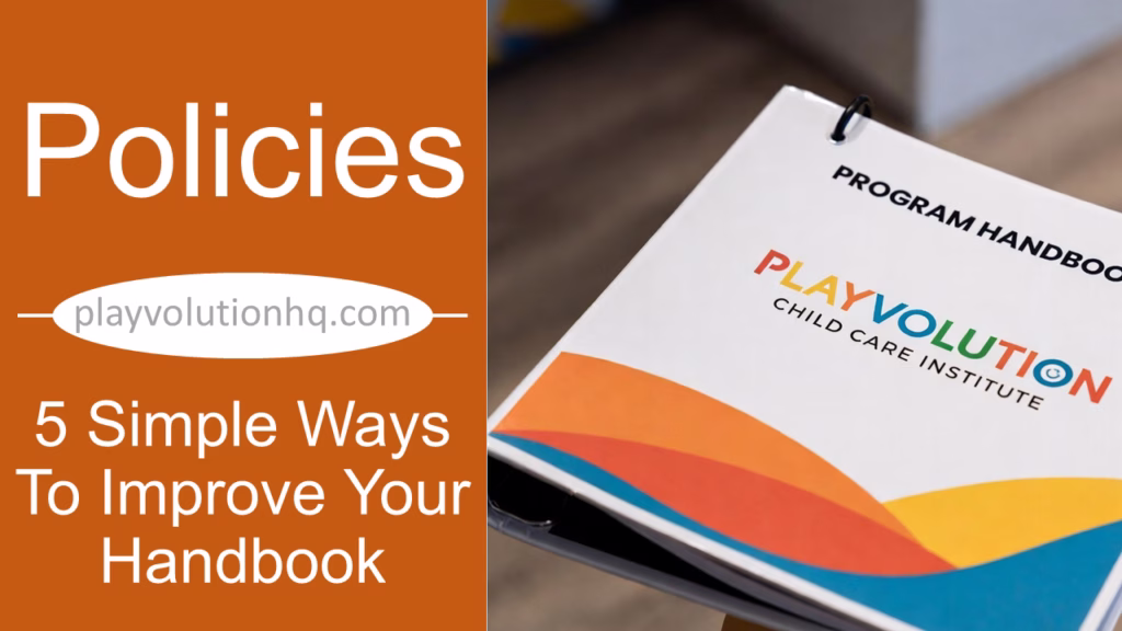
I came up with these 5 simple ways to improve your handbook after reviewing 120-plus early learning program handbooks as part of my research for creating the Policies And Procedures section of the Playvolution HQ site. To put it mildly, some of the documents I reviewed were not user-friendly.
That’s a problem because program handbooks are repositories of important information, and that information should be easily accessible. Looking up what the process is for letting Grandma pick up little Abner for a doctor’s appointment—or checking which holidays the center is closed for—shouldn’t be a tedious endeavor.
Attending to these 5 suggestions will make your handbook both more useful and more likely to be followed.
Organize Content
The first thing that jumped out during my deep dive into more than 120 early learning program handbooks was how many lacked coherent organization. One section on Operating Hours might be followed immediately by Behavior Management, then Holiday Closings, then Medication Administration. Those handbooks felt more like patchwork quilts than thoughtfully structured resources.
Even when the content was grouped logically, most lacked a table of contents. So families and staff still had to hunt for what they needed.

A few well-organized handbooks had tables of contents—but no page numbers, which defeated much of the purpose.
Improve your handbook by including a clear table of contents (with clickable hyperlinks if it’s a digital document) and having page numbers. Done right, this simple structure turns a daunting document into something people actually use.
For reference, here’s a comprehensive handbook outline I’ve developed as an example of solid organization. On a related note, I recommend that most programs consider the 3 handbook method (parent handbook, staff handbook, and Operating Handbook) for even more clarity and focus that will improve your handbook(s).
Digestible Information
This tip builds directly on organization. The handbooks that were easiest to read broke up information with bulleted lists, tables, illustrations, and charts instead of relying on long paragraphs that bury key details. Dense text can quickly overwhelm busy parents and staff.
Here’s how each helps improve your handbook:
- Bulleted Lists—Great for steps, requirements, or related items. They make key points stand out clearly. Handbook uses: daily drop-off routines, supply lists, positive guidance strategies.
- Tables—Perfect for comparisons, schedules, or guidelines. Readers can scan and find exactly what they need. Handbook uses: tuition rates by program, daily schedules, illness exclusion criteria.
- Illustrations—Help families visualize your program. Handbook uses: classroom or playground layouts, pick-up/drop-off parking instructions.
- Charts—Ideal for showing proportions, timelines, or overviews at a glance. Handbook uses: daily time allocation (e.g., pie chart of play vs. routines), enrollment process timeline, tuition options comparison.
The key is simplicity—whether it’s a list, table, illustration, or chart. If they get cluttered or overly complex, they’re no better than walls of text.
Ample Photos
This one could easily have fit into the previous section on visual tools, but it deserves the spotlight. The handbooks that stood out in my reviews were the ones filled with real photos from the actual program. They weren’t just more engaging and pleasant to read—they gave a genuine sense of the program’s warmth, energy, and play-based spirit.
If you’re looking to elevate your handbook, add plenty of your own photos. Focus especially on children in action: hard at play, deeply engaged with interesting materials, exploring, collaborating, and just plain joyful.

Photos also serve a practical purpose, like the illustrations we talked about earlier. A quick shot can clearly show parents what a family-style lunch looks like, what we mean by resilient playground surfacing, or exactly where the sign-in kiosk and paperwork dropbox are located.
If you’re including photos of children (and you absolutely should), always secure proper photo releases first. And skip the stock or AI images—they come across as generic and insincere once families realize those aren’t your kids or your classrooms.
For an even more vivid experience in your digital handbook, consider embedding a few short videos: a quick clip of morning arrival, outdoor play, or a project in progress. Keep them brief so they load easily and hold attention.
Thorough Proofreading
The worst proofreading blunder I encountered in my handbook reviews? An entire document where the program’s own name was consistently misspelled: “Something Something Developmant Center.” Ouch.
Nothing undermines your professionalism faster than typos—especially when it’s your center’s name on every page. A thorough proofread catches those errors and keeps your handbook credible.
I’m a notoriously bad speller myself (always have been), and I’m shure a few typos have slipped through on this site over the years. But I make the effort because it matters. Here’s what works for me:
- Run built-in spell-check and grammar tools first (they catch the obvious stuff).
- Read the document aloud—it helps spot awkward phrasing and missed words.
- Get fresh eyes: Ask a detail-oriented teacher, admin, or even a parent volunteer to review it.
- Check for consistency: Use the same terms throughout (e.g., always “positive guidance,” never switching to “discipline”).
- Increasingly, I lean on AI tools to scan for errors and suggest clearer phrasing.
It’s a bit of a hassle, yes—but far less hassle than families or staff stumbling over mistakes that make you look careless. A polished handbook shows the same attention to detail you give the children every day.

Consistent Formatting
Finally, improve your handbook by keeping the formatting consistent.
One thing that jumped out in my handbook reviews was inconsistency: fonts changing halfway through, margins shifting from page to page, and headings styled differently every few sections. Those small variations add up fast and make the whole document feel haphazard and harder to read.
A uniform look, on the other hand, instantly signals professionalism and care.
Here are some straightforward tips to get it right:
- Choose one or two fonts only—Use a clean sans-serif like Arial or Open Sans for body text and a bolder version for headings. Too many fonts look cluttered.
- Use consistent heading styles—Keep main sections the same size/boldness and subsections uniform—this creates easy visual hierarchy.
- Keep paragraphs short—Limit to 3–5 lines max with plenty of white space. Busy parents appreciate scannable text.
- Bold key terms and deadlines—Highlight important details like “tuition due” or “illness policy” so they jump out.
These quick choices give your handbook a calm, polished feel—mirroring the thoughtful environments you create for children every day.
5 Simple Ways To Improve Your Handbook Wrap-Up
Handbooks are a pain in the ass—no one reads an article titled 5 Simple Ways To Improve Your Handbook and then jumps right into handbook editing.
But even one small tweak (a quick table, a couple of real photos, or fixing the typos) cuts down on confusion and headaches for everyone. Pick away at items on this list whenever you do open that document, and the improvements will add up.
You’ll end up with something easier for families and staff to use—one that actually reflects your program’s warmth and professionalism, and lets everyone spend less time on paperwork and more on the children’s play and growth.
Which tip to improve your handbook will you try first? Drop it in the comments—I’d love to hear!

Brought to you by Explorations Early Learning
Contribute content to Playvolution HQ
Browse Trainings
Post Author

Jeff Johnson is an early learning trainer, podcaster, and author who founded Explorations Early Learning, Playvolution HQ, and Play Haven.
Leave a Reply